
I had the good fortune to attend an excellent conference two weekends ago entitled Understanding Indonesia: Revealing the Mysteries of Asia’s Inscrutable Giant. I’m not sure how many mysteries we revealed, but I definitely learned a lot.
As part of my presentation, I put up a graphic illustrating Indonesia’s economic transformation since independence. I frequently make note of how Indonesia grew more prosperous under the New Order (see e.g. here), but these are measures of absolute economic change relative to Indonesia’s history. It is also useful to consider how Indonesia changed relative to other countries in the world. So what I have done is, for every year, ranked Indonesia relative to other countries in the world according to GDP and GDP per capita. I then normalized that ranking on a 0-100 scale to account for the growth of the number of countries in the world. Here is what you get.
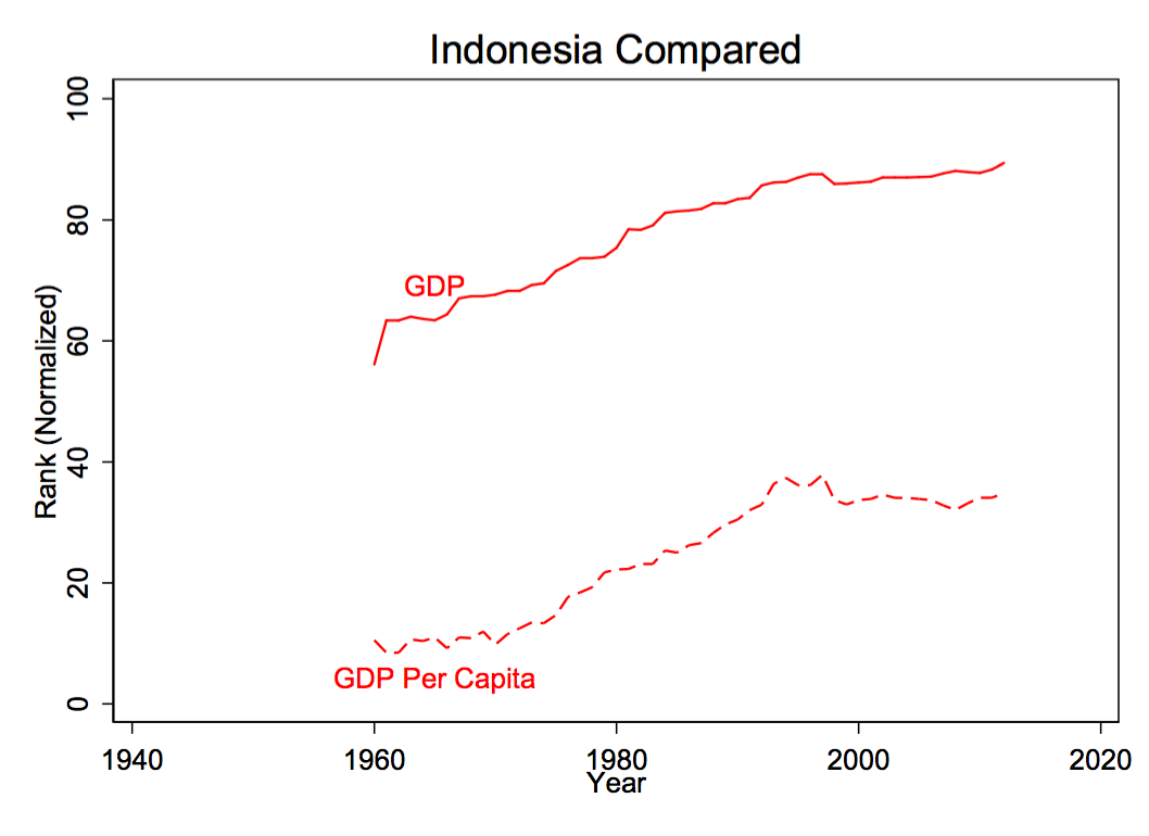
The dotted line is the important one: between the 1960s and the late 1990s Indonesia did not just grow, it progressed relative to other countries. This is the truly remarkable part of Indonesia’s economic transformation.

Comments
One response to “Indonesia Compared”
use “…qog_std_ts_jan15.dta”, clear
by year, sort: egen rankgdppc = rank(wdi_gdppccon)
by year, sort: egen countgdppc = count(wdi_gdppccon)
gen normrankgdppc = 100*(rankgdppc/countgdppc)
by year, sort: egen rankgdp = rank(wdi_gdpcon)
by year, sort: egen countgdp = count(wdi_gdpcon)
gen normrankgdp = 100*(rankgdp/countgdp)
twoway (tsline normrankgdp if cname==”Indonesia”, lcolor(red)) ///
(tsline normrankgdppc if cname==”Indonesia”, lcolor(red) lpattern(dash)) , title(Indonesia Compared) ///
ytitle(“Rank (Normalized)”) legend(off) text(70 1965 “GDP”, color(red)) text(5 1965 “GDP Per Capita”, color(red))
graph export “…comparison.eps”, replace