
Now that the official results of Indonesia’s 2014 legislative elections have officially been released, we can see just how party seat shares in the DPR have changed. A slope graph really helps to illustrate things nicely.
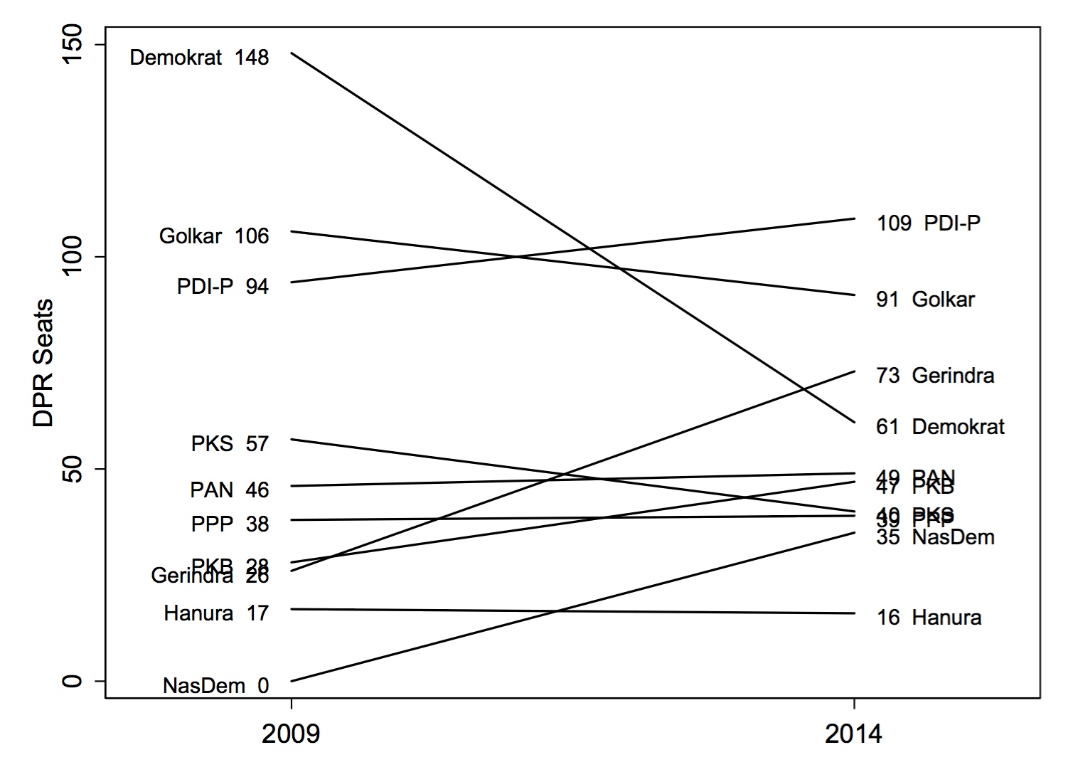
I think this compares really favorably to the stacked bar charts and pie charts I had been using previously.

Comments
One response to “Visualizing DPR Results, 2009-2014”
Nice!
I’m a slopegraph evangelist, particularly if they replace stacked bars or pie charts. I hope they catch on now that they are pretty easy to do in R.