
Not so long ago I mused about how governments can lie with statistics, focusing on incredible claims of 12% annual GDP growth in Myanmar. I find transparently lying with statistics to be a puzzling thing for governments to do, because the most egregious cases are obvious to everyone, and why bother fabricating data that everyone knows is fabricated?
That question aside, some governments clearly do put effort into lying with statistics. And it’s hard to quantify how much they are lying. One very cool recent study by Jeremy Wallace looks at GDP figures and electricity consumption rates in China to show that provincial GDP figures seem to go up more during politically sensitive times.
Still, sometimes a picture is worth 10,000 words. And today, via the Supply Side Liberal, I come across this incredible figure by Ezequiel Tortorelli.
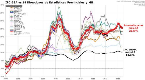
This has to be in the top 10 best political economy graphs of all time. It shows the difference between national inflation figures as released by Argentina’s federal government (the black line) and the inflation figures released by Argentina’s provincial governments (the other lines). The divergence in 2007 corresponds to a widely acknowledged move by the government of Cristina Fernández de Kirchner to start intervening in federal statistics. Lying with inflation statistics, illustrated.
Yet still I wonder—given that everyone, even me, already knew that the Kirchner government’s statistics were fishy, why do this?
