The United States is not going to meet President Joe Biden’s target of 70% of the eligible population vaccinated by July 4th. This is not because of a lack of supply or capacity: in every state in the country, any eligible adult can get a vaccine.* Although issues of access surely explain why some Americans have not been vaccinated yet, it almost certainly does not explain the United States’ failure to meet President Biden’s target. The bigger issue is that many eligible Americans are choosing not to get vaccinated.
What explains this disappointing result? For a couple of weeks now, people have been noticing that there is a strong relationship between President Trump’s 2020 vote share and vaccination rates. Here is Seth Masket:
But state-level results are still a pretty coarse measures–just compare 71.4% vaccinated in Tompkins County, NY (where I live) to 50.7% in Yates County, NY (not far from here). But we can repeat the same analysis at the county level, across the American states, and here is what we find.

There is a strong negative correlation across nearly every state in the union between county-level Trump vote share in 2020 and vaccination rates, measured using data maintained by the CDC.
This would seem to be pretty clear evidence of a link between Trump support and vaccine hesitancy. But there are a lot of reasons why this correlation might exist that have nothing to do with Trump itself. Here are some alternative explanations:
- Trump-supporting counties are rural, and rural counties have lower vaccination rates due to supply, capacity, or distance-of-travel issues.
- Trump-supporting counties how small populations, and in counties with smaller populations the urgency of vaccination is lowers than in counties with large populations.
- Trump-supporting counties are also Republican counties, so we’re not picking up something particular to Trump, but rather an artifact of partisanship in 2020.
- Trump-supporting counties are majority white, and whites have lower vaccination rates. Now, this idea gets at the racial dimensions of vaccine hesitancy, although it runs exactly counter to the expectation that vaccine hesitancy is higher–and, critically, vaccine access is lower–among Black and Hispanic populations.
There are plenty of other ideas that we could explore here too. To do so, we can use the tried-and-true method of multiple regression.
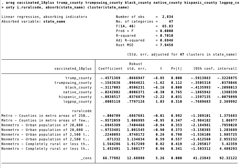
The analysis below shows the correlation between county-level vaccination rates (18+) and a range of predictors that can capture the ideas above:
- Trump Swing: the county-level swing towards Trump between 2012 and 2020, to distinguish between a correlation due to Republican support and a correlation due to Trump support.
- Black, Hispanic, and Native population shares from the 2019 American Community Survey: to pick up racial and ethnic dimensions of vaccine hesitancy.
- County-level population (in log terms), also from the ACS.
- Indicators for how urban or rural a county is.
- State effects: to capture whatever differences in counties are associated with the state that the county is in.
Here is what happens when we enter these all in a regression.

The findings are clear: vaccination rates are negatively correlated with county-level Trump support in 2020, but not the county-level Trump swing, suggesting that whatever “Trump effect” there is is due to partisanship rather than Trump. Conditional on other variables, we also see lower vaccination rates in counties with larger Black and Hispanic population shares. There is no general relationship between county population or urban-rural factors.
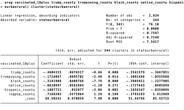
Another way to slice this, though, would be to recognize that there are probably differences between rural counties in New York and rural counties in Wyoming, or Orange County, CA versus Orange County, FL, two large metropolitan counties. To capture this, I’ve created a new analysis that uses “state-by-urban/rural-county” fixed effects. Here is what we find:

How can we make sense of these findings? When we look at the table of scatterplots at the beginning of this post, we do see that the relationship between Trump support and vaccination rates is different in different parts of the country. Why might this be? To investigate, we can estimate a multilevel/hierarchical regression model that allows for the county-level correlations to themselves depend on state factors: state-level population, racial/ethnic share, and so forth. My analysis shows no evidence that those factors explain differences in county-level patterns across states: in other words, knowing the state-level support for Trump doesn’t help us to explain anything about vaccination rates that we cannot figure out using county-level support for Trump, and knowing the state-level Black population share doesn’t give us any more explanatory power than county-level Black population share, etc.
However, we can also check to see if there are geographical differences by allowing county-level correlations to vary by census division, a geographic unit defined by the U.S. Census Bureau.

Estimating such a model produces a mess of coefficients, interactions, and variance components that are hard to interpret. So to see how geography matters, I’ve plotted the estimates for four important variables across census divisions.

There is a ton to learn from this figure, so let’s take our time with it. Each plot shows you a “coefficient” by a census division: read these, for instance, as “the correlation between black population share and vaccination rates in the Pacific division, controlling for other factors.” The lines reflect 95% confidence intervals. We learn that
- There is always a negative correlation between county-level partisanship and vaccination rates, although the size of this correlation is stronger in some parts of the country (i.e. the West) than in others (i.e. New England).
- The distinctly Trumpian relationship between Trump support and vaccination rates is confined primarily to the middle Atlantic, the Midwest, the Middle South, and the Mountain regions. The Trump effect seems to be mostly a Rust Belt phenomenon.
- There is also always a correlation between Black population share and vaccination rates, net of other factors like urban/rural differences, state effects, and so forth. And importantly, this is not just something that we find in the South: it is evident everywhere, and actually tends to be smaller in the South** than in other parts of the country.
- There is no general pattern that we can see between Hispanic population share and vaccination rates, once we account for other factors in this more comprehensive model.
A fuller and more complete analysis of the political and social correlates of vaccination rates will have to wait for another time. But I have placed all of these data and replication commands online to allow anyone to recreate these analyses, update the data with new or more complete vaccination figures, and add new variables (partisanship of the governor! county-level measures of poverty!) that might further refine these preliminary findings.
NOTE
* The enormous privilege of it all. Right now there are private companies advertising three week trips for Indonesians to travel to the U.S. to get their vaccine, given the slow rollout of vaccines there.
** However, these coefficients are most precisely estimated in the South.
