A new NBER working paper by Paul Goldsmith-Pinkham, Peter Hull, and Michal Kolesár shows that in experiments with more than one mutually exclusive treatment, regression with covariate adjustment does not identify treatment effects even under the assumption of conditional ignorability. Here is the abstract:
We study the interpretation of regressions with multiple treatments and flexible controls. Such regressions are often used to analyze stratified randomized control trials with multiple intervention arms, to estimate value-added (for, e.g., teachers) with observational data, and to leverage the quasi-random assignment of decision-makers (e.g. bail judges). We show that these regressions generally fail to estimate convex averages of heterogeneous treatment effects, even when the treatments are conditionally randomly assigned and the controls are sufficiently flexible to avoid omitted variables bias. Instead, estimates of each treatment’s effects are generally contaminated by a non-convex average of the effects of other treatments. Thus, recent concerns about heterogeneity-induced bias in regressions leveraging potential outcome restrictions (e.g. parallel trends assumptions) also arise with “design-based” identification strategies. We discuss solutions to the contamination bias and propose a new class of efficient estimators of weighted average effects that avoid bias. In a re-analysis of the Project STAR trial, we find minimal bias because treatment effect heterogeneity is largely idiosyncratic. But sizeable contamination bias arises when effect heterogeneity becomes correlated with treatment propensity scores.
This is surprising and striking. It is surprising because when there is exactly one treatment and one control, regression does identify treatment effects. It is striking because lots of experiments have more than one treatment condition, and scholars often use covariate-adjusted regression to estimate causal effects in these regressions. Importantly, these results are not only true for estimating treatment effects, but also for describing conditional group averages. The authors write,
Even more broadly, contamination bias can arise in descriptive regressions which seek to estimate averages of certain conditional group contrasts without assuming a causal framework—as in studies of treatment or outcome disparities across multiple racial or ethnic groups, studies of regional variation in healthcare utilization or outcomes, or studies of industry wage gaps. Our analysis shows that in such regressions the coefficient on a given group or region averages the conditional contrasts across all other groups or regions, with non-convex weights
These results have implications for how scholars use statistical models to summarize demographic and sociological data across groups. My goal in this post is to illustrate one such implication.
Before getting to that, though, let’s review the issue at hand. The working paper explains all of the intuitions well and derives the analytical results clearly, but here is one of these cases where I find that I don’t really understand the phenomenon in question unless I work through it myself.
Simulating Contamination Bias
Here is the code to simulate a regression with two mutually exclusive treatment states and a control state, which we can represent as t(0), t(1), and t(2). Treatment probabilities vary across three different groups W = 1, 2, 3. For example, individuals in group W=1 receive the control t(0) with a probability of .1, they receive the first treatment t(1) with a probability of .5, and the second treatment t(2) with a probability of .5; but individuals in group W=2 are equally likely to get each of two treatment states and the control. And so forth.
tosim <- function(effect1,effect2,effect3){
t <- c(
sample(c(0, 1, 2), size = n_w, replace=TRUE, prob = c(.1,.4,.5)),
sample(c(0, 1, 2), size = n_w, replace=TRUE, prob = c(1/3,1/3,1/3)),
sample(c(0, 1, 2), size = n_w, replace=TRUE, prob = c(.5,.4,.1))
)
modelmat <- data.frame(rep(NA,3*n_w),t,c(rep(1,n_w),rep(2,n_w),rep(3,n_w)))
names(modelmat) <- c("y","t","w")
modelmat$y[modelmat$w==1 & modelmat$t==0] <- 0 + rnorm(length(modelmat$y[modelmat$w==1 & modelmat$t==0]),0,3)
modelmat$y[modelmat$w==1 & modelmat$t==1] <- 0 + rnorm(length(modelmat$y[modelmat$w==1 & modelmat$t==1]),0,3)
modelmat$y[modelmat$w==1 & modelmat$t==2] <- effect1 + rnorm(length(modelmat$y[modelmat$w==1 & modelmat$t==2]),0,3)
modelmat$y[modelmat$w==2 & modelmat$t==0] <- 0 + rnorm(length(modelmat$y[modelmat$w==2 & modelmat$t==0]),0,3)
modelmat$y[modelmat$w==2 & modelmat$t==1] <- 0 + rnorm(length(modelmat$y[modelmat$w==2 & modelmat$t==1]),0,3)
modelmat$y[modelmat$w==2 & modelmat$t==2] <- effect2 + rnorm(length(modelmat$y[modelmat$w==2 & modelmat$t==2]),0,3)
modelmat$y[modelmat$w==3 & modelmat$t==0] <- 0 + rnorm(length(modelmat$y[modelmat$w==3 & modelmat$t==0]),0,3)
modelmat$y[modelmat$w==3 & modelmat$t==1] <- 0 + rnorm(length(modelmat$y[modelmat$w==3 & modelmat$t==1]),0,3)
modelmat$y[modelmat$w==3 & modelmat$t==2] <- effect3 + rnorm(length(modelmat$y[modelmat$w==3 & modelmat$t==2]),0,3)
sim <- summary(lm(y~factor(t)+factor(w), data=modelmat))$coefficients
return(c(sim[2,1],sim[2,4]))
}
We are interested in estimating the effect of t(1) relative to the control t(0). In this example, the average treatment effect is zero for all individuals in all three groups. However, the average treatment effect of the second treatment varies across groups, represented by the variables effect1, effect2, and effect3. We estimate the following regression:
lm(y~factor(t)+factor(w), data=modelmat)
… and then collect the results for the first treatment effect, and we hope that the coefficients on t1 estimate the true treatment effect for the first treatment, which we know to be zero. Are we right?
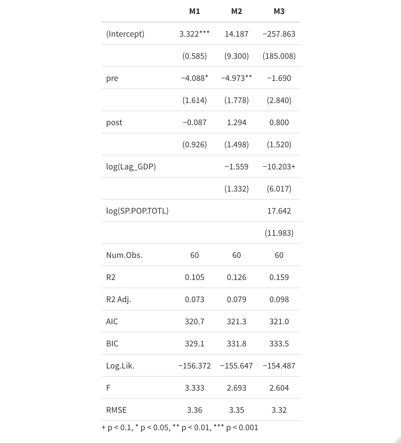
The answer is no—not unless the average treatment effect for the second treatment is constant across values of W. To see this, I’ve run that simulation 250 times each for four possible combinations of effect1, effect2, and effect3. For each combination, I plot both the estimated treatment effect for the first treatment (which we know to be zero) and the associated p-value of that estimate. I also calculate the percentage of simulations in which we would falsely reject the null hypothesis of no treatment effect for the first treatment.
We see that with any group-level heterogeneity in the effect of the second treatment, we become more likely to infer that the first treatment effect is positive, even though the true treatment effect is zero. The greater the heterogeneity in treatment effects, the worse our estimates. We only get a false positive rate that approximates the nominal expected false positive rate of 0.05 when treatment effects are identical across groups.
As it turns out, it’s essential that the probability of treatment assignment varies across W. If I do the same simulations with equal assignment probabilities within W, our estimates of the effect of the first treatment are correct no matter how heterogenous the effects of the second treatment.
With that in mind, let’s turn to a case of quantitative description.
Quantitative Description with Intersectionality
Imagine there were a country with three communal groups: Magenta, Cyan, and Indigo. In this country’s 1970 census, there were differences in urbanization rates among these three groups.
- Magentas, who are 60% of the population, are 85% rural and 15% urban.
- Indigos, who are 10% of the population, are 66% rural and 34% urban.
- Cyans, who are 30% of the population, are 53% rural and 47% urban.
We are interested in testing whether there are income differences between Indigos and Magentas, and collect a simple random sample of 1000 respondents. Because we think that there are differences in income between urban and rural people, and we know that the distribution of urban versus rural varies by communal group, we control for urban and rural status too.
Let us stipulate the following:
- urban people have higher incomes than rural (urban – rural = 1).
- Indigos have lower income than Magentas (Indigo – Magenta = -1), and this is the same for urban and rural Indigos
- Urban Cyans and rural Cyans have higher incomes than urban Magentas and rural Magentas, respectively
We then run this regression:
lm(income~factor(community)+factor(urban))
Magentas are the base category, and we hope that the coefficient on Indigos represents the urban-adjusted average difference in income between Magentas and Indigos, which should be -1. Does it?
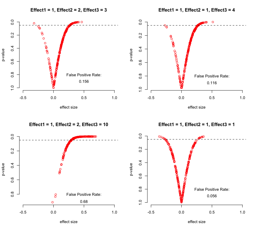
Once again, no. The figure below compares the distribution of estimated differences in income between Indigos and Magenta from that regression, repeated 250 times for each combination of differences between urban/rural Magentas and Cyans.
In the top two plots, where there are no income differences between Magentas and Cyans or where the urban Magenta/Cyan difference is the same as the rural Magenta/Cyans difference, all is fine. But in the remaining plots, the estimated Magenta/Indigo difference differs from the truth, with the direction and size depending on whether the urban Magenta/Cyan differences are bigger than the rural Magenta/Cyan differences.
Goldsmith-Pinkham et al show that we can recover the correct estimates of the differences between Magentas and Indigos by interacting the communal indicators with the demeaned urban-rural indicator (reminiscent of the Lin adjustment).
meanw <- modelmat$w-mean(modelmat$w)
lm(y~factor(t)*meanw)
This works no matter if there is urban/rural heterogeneity in the Magenta/Cyan difference. Below, I add the results from that approach in bold green to show how it works:
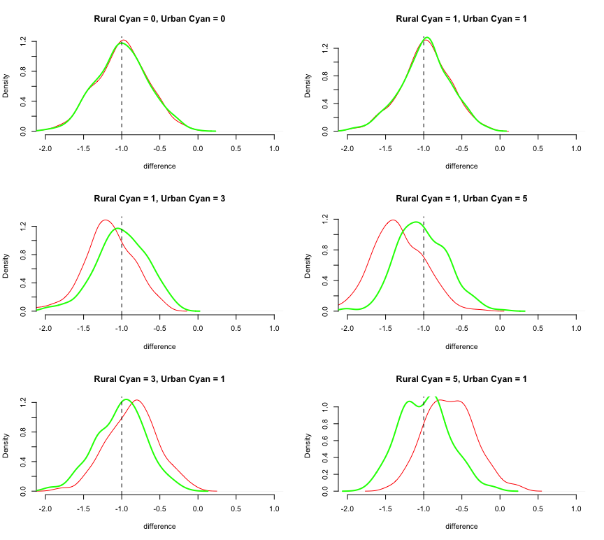
The green distributions are centered on the true difference, as they should be.
Intersectional Description
Stepping back from this example, the results here have important implications for how we describe group-level differences in the presence of intersectional differences. By intersectional differences I mean phenomena like the difference between men and women in some outcome is different for black and white people; or the difference between urban and rural outcomes varies according to immigration status.
Intersectionality is widely understood in the social sciences as a conceptual matter. And it is also fairly well-known that we can accommodate intersectionality in quantitative description by describing features as interacting multiplicatively rather than additively. It would seem obvious that ignoring intersectionality will mean that you will, in fact, not be able to uncover intersectional differences. But Goldsmith-Pinkham et al’s results are novel in a subtle and important way.
Specifically, if there are more than two groups that you are comparing, then the presence of intersectional differences in groups A and B affect our estimates of differences between groups A and C even if there are no intersectional differences between A and C. When we have complex comparisons among mutually exclusive categories, like race (white, black, Asian, etc…) or class (working class, middle class, upper class, etc…) or nationality (German, British, American…) then any intersectionality in any one category will affect estimates of differences across every other category, even when there are no intersectional differences in those other categories.
Here is a case where simple analytical tools that work well in simple cases may yield truly erroneous conclusions in more complex cases.