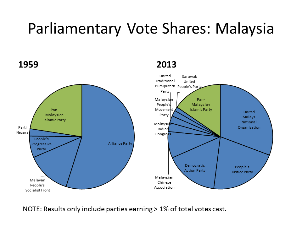
My post on Islamism and Elections in Southeast Asia got some nice feedback, and I’m convinced that the simple graphics helped. I was surprised, though, at the amount of offline feedback that I got about (1) the fact that I chose pie charts and (2) that I did them in Excel.
An admission: I spend a huge amount of time working on my graphics. JMP calls it “fiddling” and “tinkering,” but in a positive way. It might have to do with the fact that (like George Costanza) I wanted to be an architect when I was younger, but it turns out that the artistic gene skipped me. I’ve also been influenced by my neighbor, who has taught me some about design over the past couple of years.
I use Excel to make graphs when I need something fast. But for professional things I’ve been trying to move to R for plotting and graphing—it looks cleaner, and your R script allows anyone to recreate your exact figures (impossible with Excel). After I wrote that quick post last night, I had the off-hand thought that people might not take me seriously at my presentation this Friday because I used Excel. I’m not sure that’s the right conclusion, but I did get feedback that the charts were a bit ugly.
But that’s a minor issue compared to the pie charts: people have very strong opinions about pie charts! I made a special point to issue a caveat in the last post, but even so, the pie chart haters abound. Here’s Edward Tufte, whose opinions of pie charts seem to have set the tone of the discussion:
Pie chart users deserve same suspicion+skepticism as those who mix up its/it’s, there/their.To compare,use little table, sentence, not pies.
— Edward Tufte (@EdwardTufte) January 10, 2013
If you want more…just google Tufte pie chart and see what comes up.
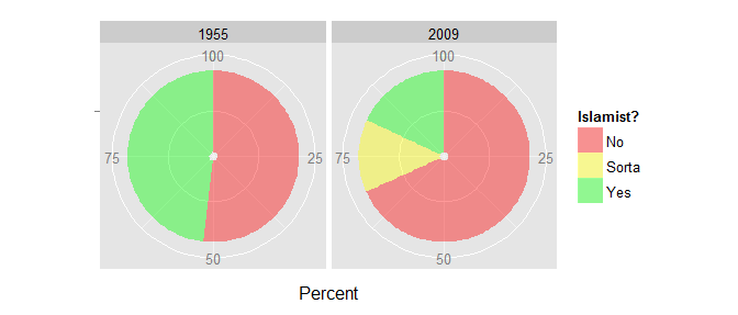
Motivated by my sense that figures created in R would probably look better, I spent some time today creating some new figures using ggplot2. Let’s compare the same information displayed two ways. First, the pie chart:

Now, the stacked bar chart:
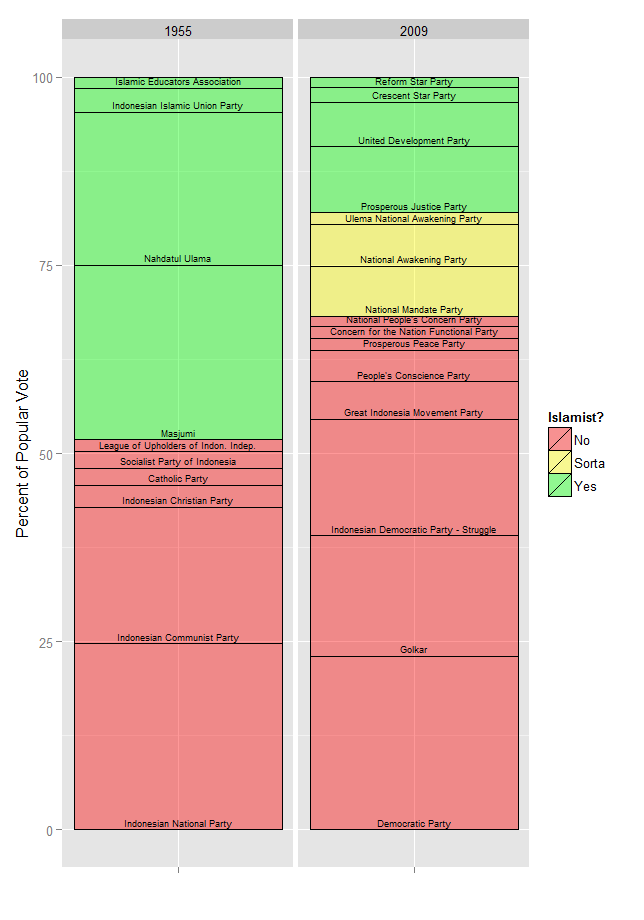
For now, just ignore the fact that I couldn’t figure out how to didn’t label the pie slices with their party names. The main thing to focus on is that both convey the exact same information. Comparing the two, I honestly don’t see what’s so bad about the pies. My main point is simply to show that the green has not encroached on the red between 1955 and 2009, and that seems to come through nicely. JMP claims that she likes the pie charts better than the stacked bar charts, although she thinks that I shouldn’t outline the slices in black for different parties within each category, for something like this:
I see her point, but I do like the idea of highlighting the number of different parties within each category.
Anyway, for Friday, I’ll almost certainly go with stacked bar charts, in R. If you’re there, tell me what you think. Oh and also, if you have some thoughts on the substance of the presentation, I’d like to hear those too.