
Unless something changes dramatically in the next couple of days, we will code this week as the onset of the 2014-15 Russian currency crisis. Using Quantmod, I’ve plotted below the evolution of the ruble-dollar exchange rate since 2010 along with 180-day Bollinger bands.

The Indonesians have a verb for this kind of currency movement: anjlok, which my Echols and Shadily dictionary defines as “to plummet,” or figuratively, to “jump the rails.”
One interpretation of the unfolding currency crisis is that this is bad news for Putin, and hence good news for US/Western foreign policy. Here are two reasons to be circumspect, at least at this stage.
Recent History
First, the historical context. Let’s look back another decade, shall we?

Russia managed to ride out the 2008-09 Global Financial Crisis pretty well. One might look to this as evidence that Putin has the “room to move” to withstand an external shock of this sort, although I’d add two caveats to this view. For one, the ruble depreciation of 2008-09 looks a lot like a return to trend than a departure from trend (as it does now). But also, and the 2008-09 depreciation is probably a consequence of a flight to liquidity during the Global Financial Crisis, which is not true today.
Regional Context
A second reason to be skeptical is the external implications of a Russian ruble crisis. Let’s also look at XR movements in the Ukraine over the same time period.

Just eyeballing this, it looks like the same pressures affecting Russia will be affecting the Ukraine too, which would mean that any harm that comes to the Russian economy would also spill over to its neighbors too, including those neighbors that are seen as friends of the U.S.
Fortunately, we know that we should not just eyeball our time series, because non-stationary time series can be misleading. I’ve plotted below the daily changes in hryvnia/USD (blue) and ruble/USD exchange rates (red).
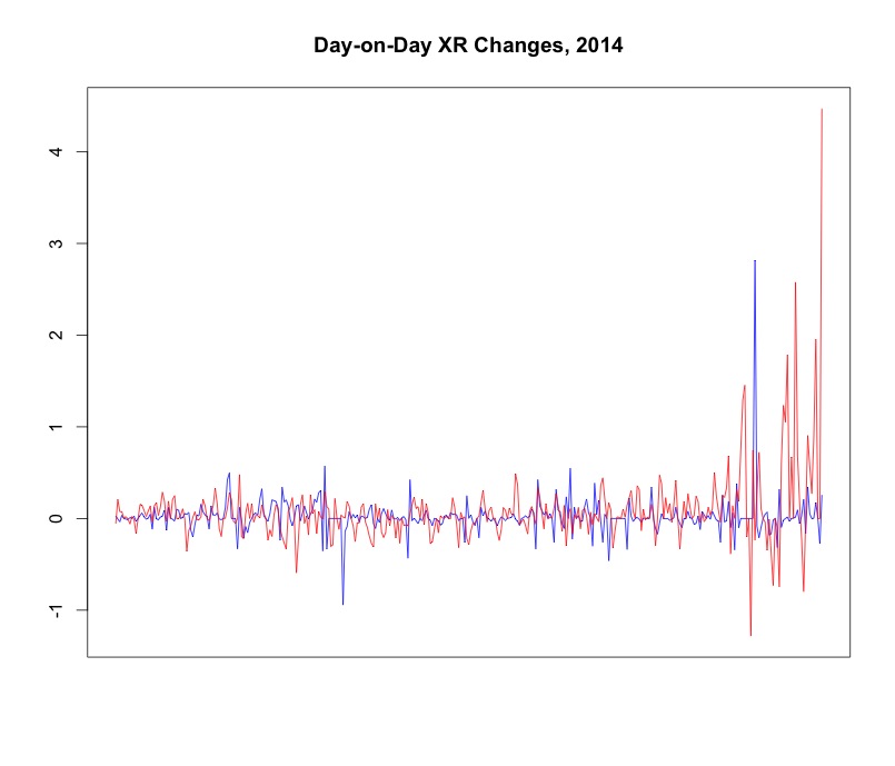
It’s not so clear that they are related. We can also look at a scatterplot of day-on-day changes.
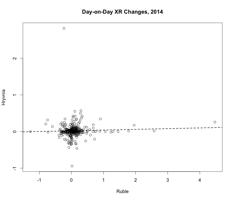
There is only the slightest positive relationship here between hryvnia-USD movements and ruble-USD movements.
So why write about this at all? Because it is also possible to show you this figure, from a time in which Ukrainian-Russian ties were not marred by invasions and things.
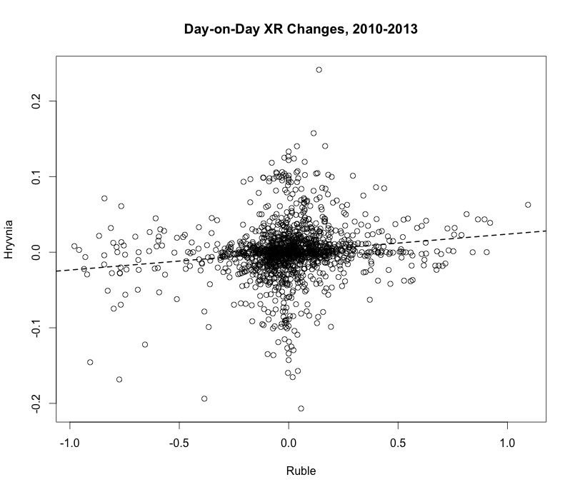
The t-stat on the line of best fit is 5.6, and remains unchanged when controlling for lagged levels of each country’s exchange rate.*** This reflects the fact that during normal times, we expect there to be spillover effects from the Russian economy to the Ukrainian economy. (This figure is all the more striking given that the Ukraine was maintaining a quasi-fixed exchange rate during this period.) The economies are really tightly integrated: Russia is the Ukraine’s largest trading partner, after all.
The takeaway thought is that currency crises have external consequences. Russia’s will too, and they might lead analysts to be careful of what they wish for, even as many of them happily watch the markets hammer Russia.
Note
*** Of course, I’d be curious to see a full ARIMAX/VECM model, and will post the R code to get all the data together in the first comment on this post.

Comments
One response to “Regional Implications of the Russian Currency Crisis”
# load packages
library(quantmod)
# gather data together to plot XR co-movements
rubles<-getFX("USD/RUB",from="2010-01-01",to="2010-12-31")
USDRUB10<-USDRUB
rubles<-getFX("USD/RUB",from="2011-01-01",to="2011-12-31")
USDRUB11<-USDRUB
rubles<-getFX("USD/RUB",from="2012-01-01",to="2012-12-31")
USDRUB12<-USDRUB
rubles<-getFX("USD/RUB",from="2013-01-01",to="2013-12-31")
USDRUB13<-USDRUB
rubles<-getFX("USD/UAH",from="2010-01-01",to="2010-12-31")
USDUAH10<-USDUAH
rubles<-getFX("USD/UAH",from="2011-01-01",to="2011-12-31")
USDUAH11<-USDUAH
rubles<-getFX("USD/UAH",from="2012-01-01",to="2012-12-31")
USDUAH12<-USDUAH
rubles<-getFX("USD/UAH",from="2013-01-01",to="2013-12-31")
USDUAH13<-USDUAH
# now merge these into a single ts object
test<-as.ts(cbind(rbind(USDUAH10,USDUAH11,USDUAH12,USDUAH13),rbind(USDRUB10,USDRUB11,USDRUB12,USDRUB13)))
diff<-diff(test,lag=1,difference=1) # create the difference
lag<-lag(test,k=1) # and the lag
newtest<-cbind(test,diff,lag) # and finally we put them all together
# ts plot
plot.ts(diff, xaxt="n", main="Day-on-Day XR Changes, 2012", plot.type = "single", col=c("blue","red"),ylab="",xlab="")
# scatter plot
plot(USD.UAH~USD.RUB,data=diff, main="Day-on-Day XR Changes, 2010-2013",ylab="Hryvnia",xlab="Ruble")
abline(lm(USD.UAH~USD.RUB,data=diff),lty=2,lwd=2)